.svg)
Accessibility in Wayfinding Isn't an Add-On. It's the Design Brief.
Why accessibility in digital wayfinding goes beyond compliance, and what it takes to get right.
.png)
Key takeaways
- Accessible digital wayfinding must be designed from the brief — not retrofitted after the core design is finished.
- The DDA (Disability Discrimination Act) applies to wayfinding in Australian hospitals, shopping centres, and government buildings.
- WCAG 2.0 Level AA is the minimum standard for the digital layer. AS1428.1, AS1428.2, and AS1428.4.2 cover the physical layer.
- The accessibility overlap zone — 700mm to 1200mm from floor level — is what makes a wayfinding kiosk usable for both seated and standing users.
- Design for the 10% who need it most. The other 90% benefits automatically.
When someone cannot find where they need to go in a hospital, it is not a minor inconvenience. For a patient navigating to an unfamiliar clinic, for an elderly visitor trying to find a ward, for someone with a vision impairment using a kiosk for the first time, a poorly designed wayfinding system does not just frustrate. It causes real harm.
Accessible digital wayfinding is not a legal obligation you design around. It is the central brief — and it applies to every hospital, shopping centre, and government building Envent works in.
What does accessibility in wayfinding actually mean?
The common framing: accessibility provides all people, regardless of capacity, equal opportunity to engage with digital wayfinding. That is correct, but it is too narrow.
Accessibility is not only about permanent disability. A person with a broken arm cannot use a standard touch interface comfortably. Someone in a noisy shopping centre cannot hear audio cues. A hospital visitor who is anxious, tired, or unfamiliar with technology runs into difficulty with systems that assume a certain baseline of capability.
Design for the 10% who need it most. The other 90% benefits automatically.
How does the DDA apply to wayfinding design in Australia?
Designers do not just build what the brief asks for. They carry a responsibility to every person who will eventually use what they build.
In Australian wayfinding design — whether for hospitals, shopping centres, or council buildings — the DDA (Disability Discrimination Act) has to be part of the designer's thinking from day one, not reviewed at the end. It cannot be a compliance checklist applied after the core design is finished. By that point, the structural decisions have already been made, and retrofitting accessibility is expensive, incomplete, and visually compromised.
The DDA has to be part of the designer's psyche. Not their checklist.
What does accessible wayfinding UI look like in practice?
Accessible UI/UX expands the usable audience for a wayfinding system, not just to people with disabilities, but to anyone whose capacity to interact is temporarily or contextually reduced.
That means high-contrast display modes for low vision, adjustable text size, screen reader compatibility, clear visual hierarchy, logical interaction sequences, and interfaces that do not punish hesitation or slow response. It also means testing with real users, not just running an automated accessibility audit.
WCAG 2.0 Level AA is the minimum benchmark. It covers perceivability, operability, understandability, and robustness. These are not four bonus features. They are the four conditions a usable interface has to meet.
How do you design a wayfinding kiosk that works for everyone?
Ergonomics is where wayfinding accessibility becomes a physical design problem.
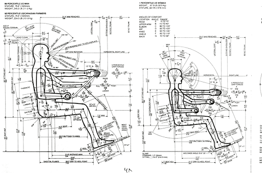
A kiosk usable only while standing excludes every wheelchair user. A screen positioned for a tall standing adult is unreachable for a child or someone using a mobility aid. The answer is not two kiosks. The answer is the accessibility overlap: a design zone simultaneously within reach for both seated and standing users.
This overlap sits between approximately 700mm and 1200mm from floor level. All primary controls, the touchscreen, the key UI elements, the interactive zones, belong within that range. Secondary information can exist above it. Nothing critical should exist only outside it.
This gets engineered into the kiosk enclosure before production, not retrofitted afterward.
Which Australian standards apply to accessible wayfinding?
Four Australian standards apply to accessible wayfinding design:
AS1428.1 (2009) covers general requirements for access and mobility.
AS1428.2 (1992) covers enhanced and additional requirements.
AS1428.4.2 (2018) covers tactile ground surface indicators.
WCAG 2.0 Level AA covers the digital interface layer.
For hospitals and government buildings where formal certification is required, obtaining a Disability Access Design Compliance Certificate is worth pursuing from the outset.
For healthcare wayfinding specifically, the combination of AS1428 physical standards and WCAG 2.0 Level AA digital standards is what defines a fully compliant accessible wayfinding system.
Frequently asked questions
Is digital wayfinding covered by the Disability Discrimination Act in Australia?
- Yes. The DDA requires that all people, regardless of capacity, have equal opportunity to access public facilities. In practice, this means wayfinding systems in hospitals, shopping centres, and government buildings must meet accessibility standards from the design stage — not as an afterthought.
-
What is the correct height for an accessible wayfinding kiosk in Australia?
- Primary controls and interactive touchscreen zones should sit within the accessibility overlap — approximately 700mm to 1200mm from floor level. This range accommodates both seated users and standing users. Secondary information can appear above this zone. Nothing critical should sit outside it.
Which digital standard applies to wayfinding kiosks in Australia?
- WCAG 2.0 Level AA is the benchmark for the digital interface layer. It covers four conditions: perceivability, operability, understandability, and robustness. AS1428.1 and AS1428.4.2 cover the physical and tactile layer.
What is the difference between accessible design and DDA compliance in wayfinding?
- DDA compliance is the legal floor. Accessible design goes further — it considers temporary impairment, cognitive load, contextual barriers (noise, anxiety, unfamiliarity), and design quality. A wayfinding system can be technically DDA compliant and still fail its users.